Samothrace Island
he tourism committee of Samothrace initiated the first official tourism campaign of the island for the season 2020. For this reason we Twere assigned to build the island’s brand identity from scratch. This is a project with multiple levels of development, because Samothrace incorporates a rich cultural and natural history along with a contemporary touristic side that offers many interesting stimulants to its visitors.
In order to build the destination identity on solid ground, we first created the logo and the initial visual aids – the tourist guide, info flyers, banners and of course the context to put island’s story in. We loved the concept of time. Time is something vague on the island. So the message that we decided it best describes the visitor’s experience is this:
“The richest moments in life are the ones that maκe time fly or stand still. In Samothrace, every moment is like that… a time illusion!”‘
Thus the campaign “Samothrace | A time illusion” was born. This project has just begun… we have a lot more to explore and create.
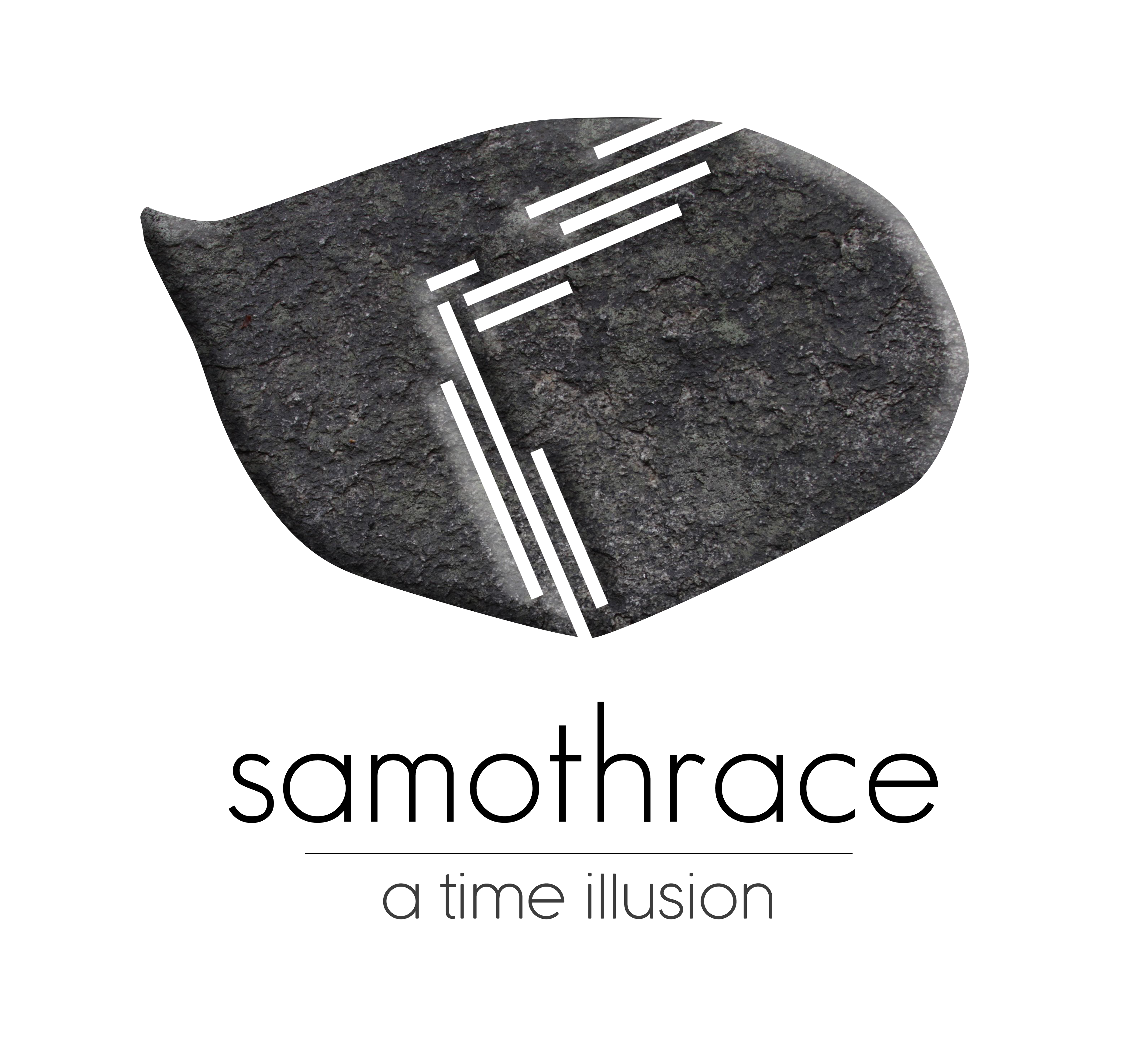
Logo
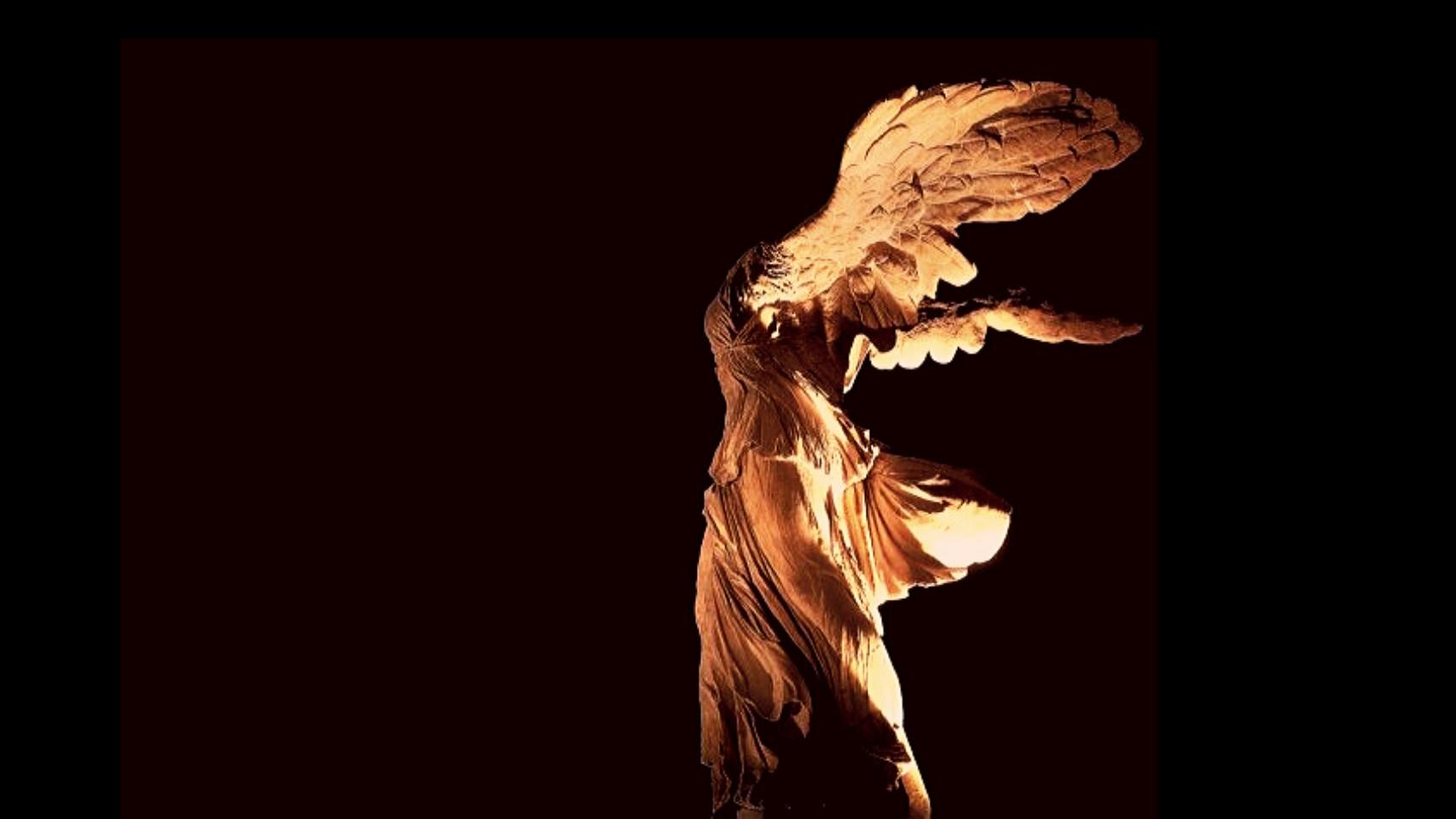
The logo was inspired by the three main cultural elements of the island.
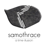
1. The stone map in the Sanctuary of Great Gods, with the island's shape. It is considered to be possibly one of the oldest maps in history.
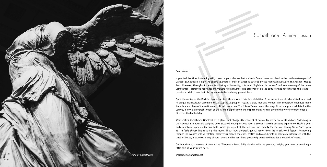
2. The figure of Nike of Samothrace, the famous statue exhibited in the Louvre.
3. The architectural style of the Sanctuary of the Great Gods.